
Melbourne City Rooftop Honey
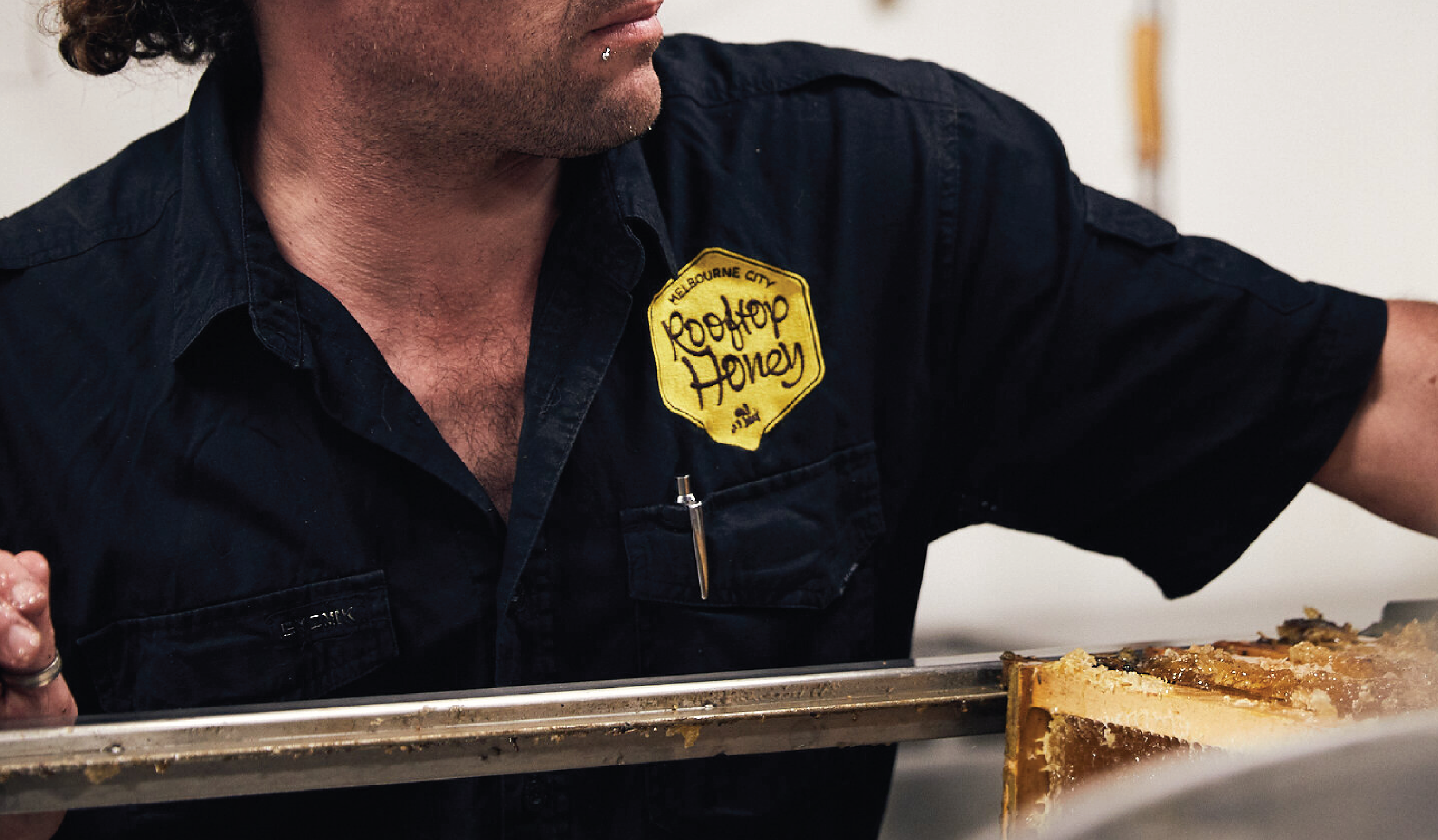
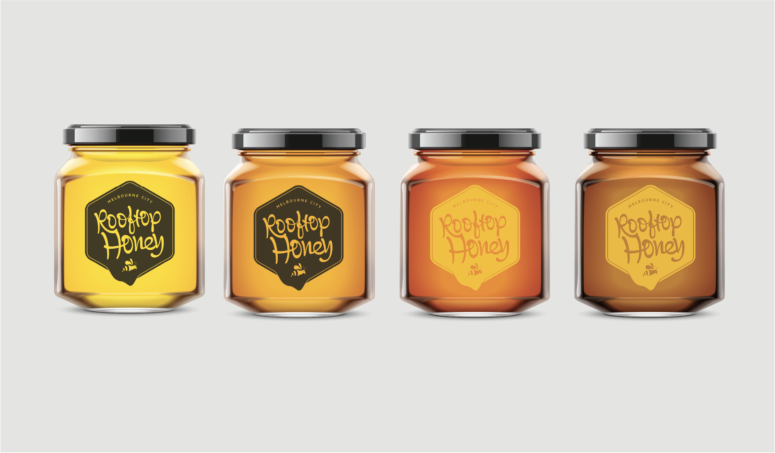
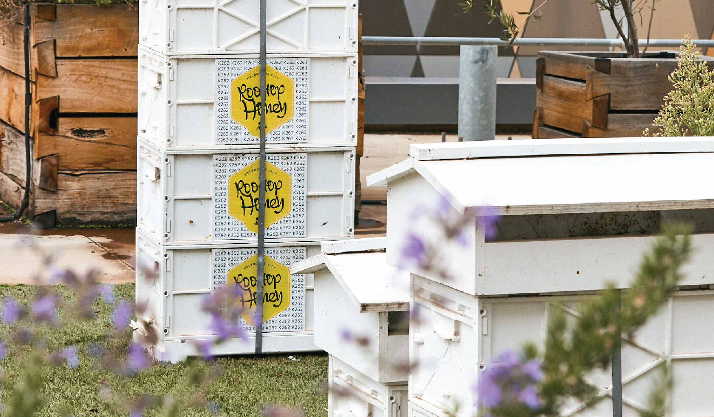
The brand identity of Melbourne City Rooftop Honey celebrates nature and the local community, centered on urban beekeeping and sustainability. The logo direction is welcoming and informative, emphasising the crucial role of reintroducing bees to the cityscape.
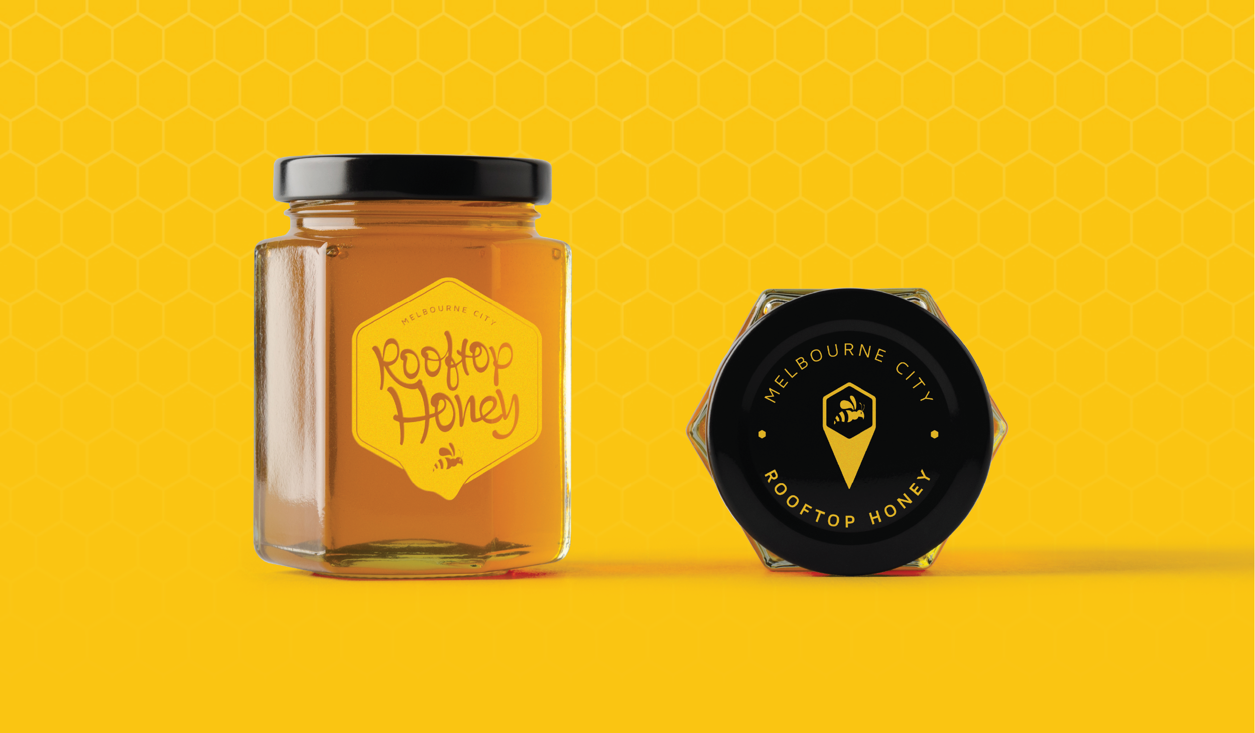
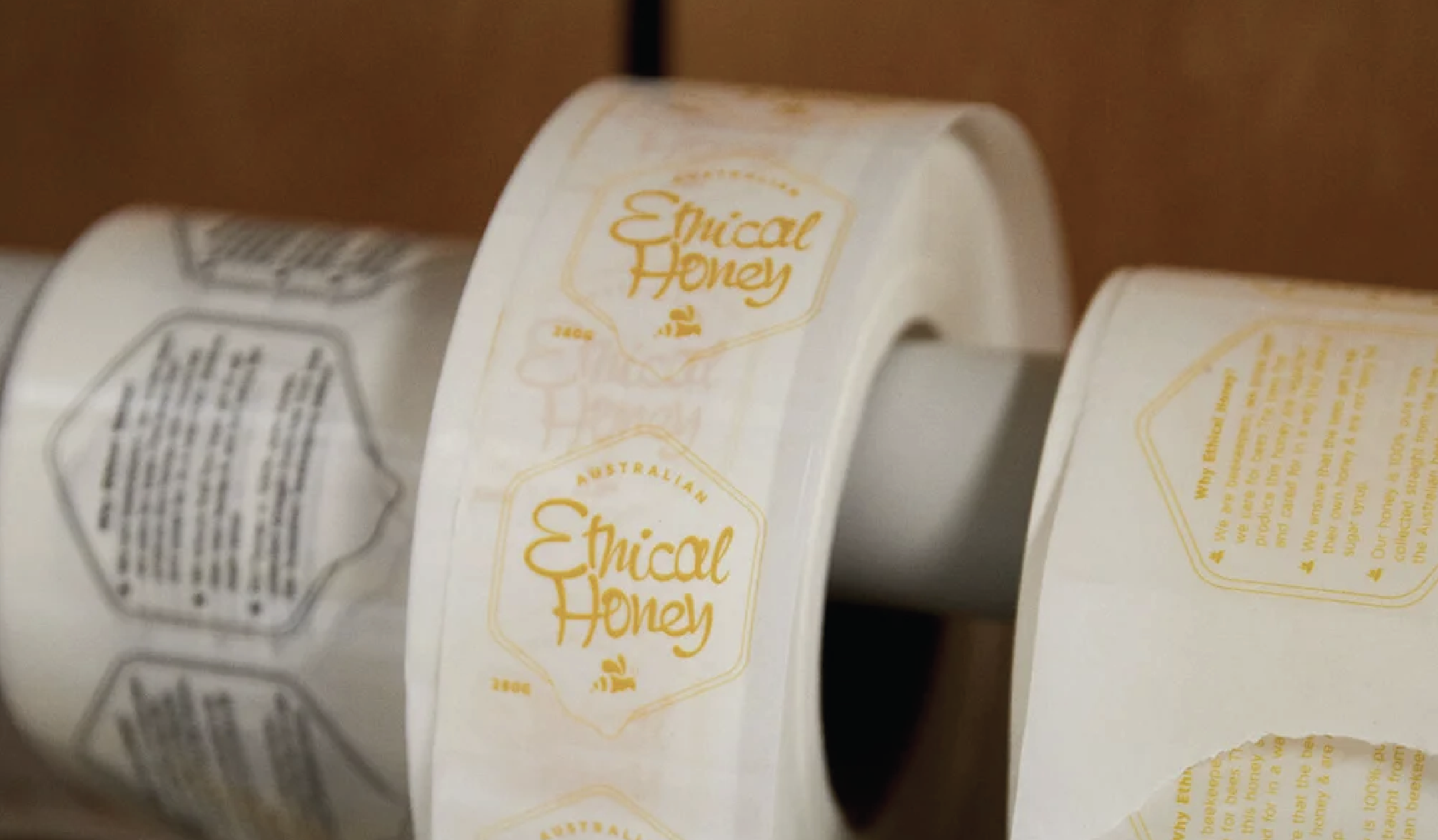
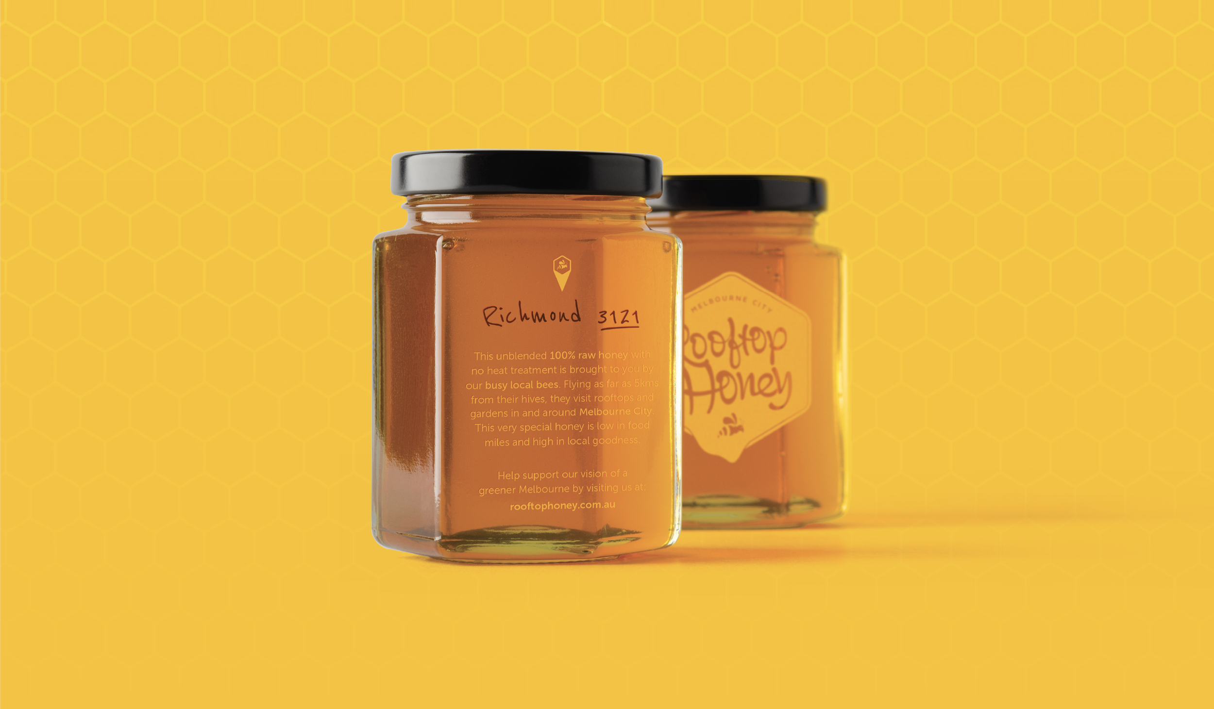
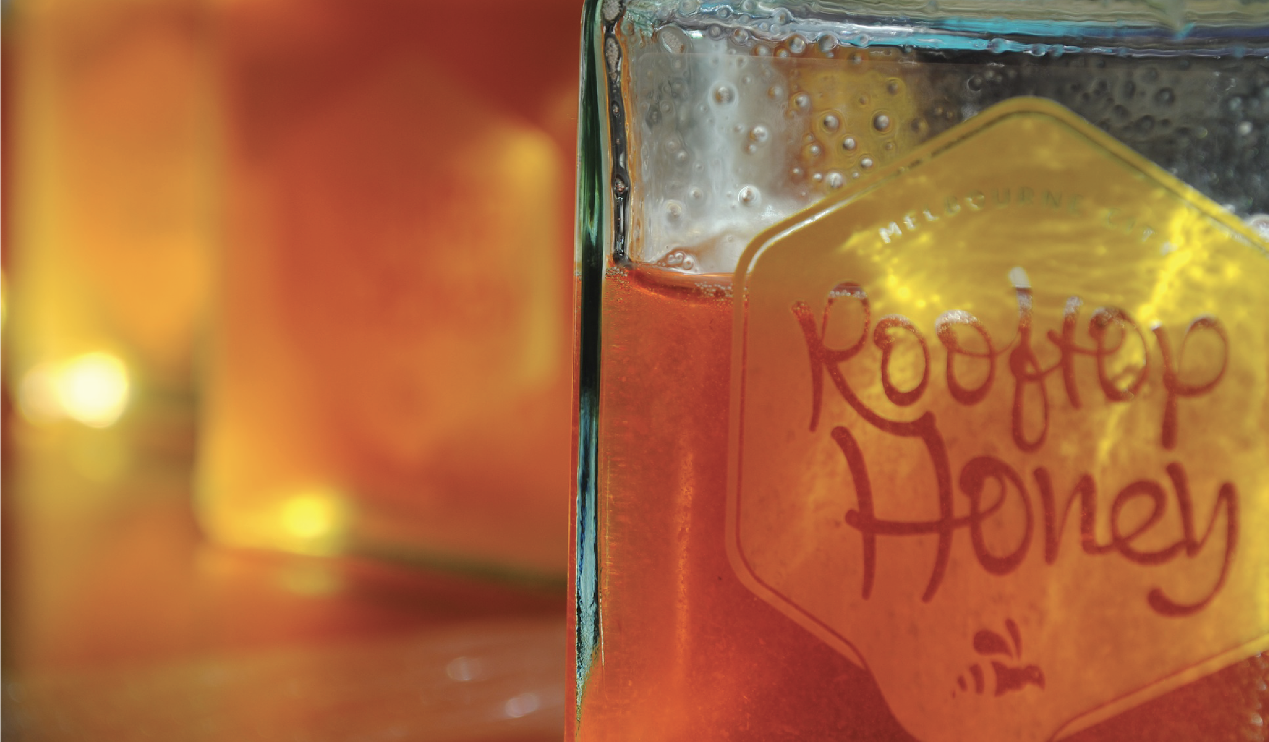
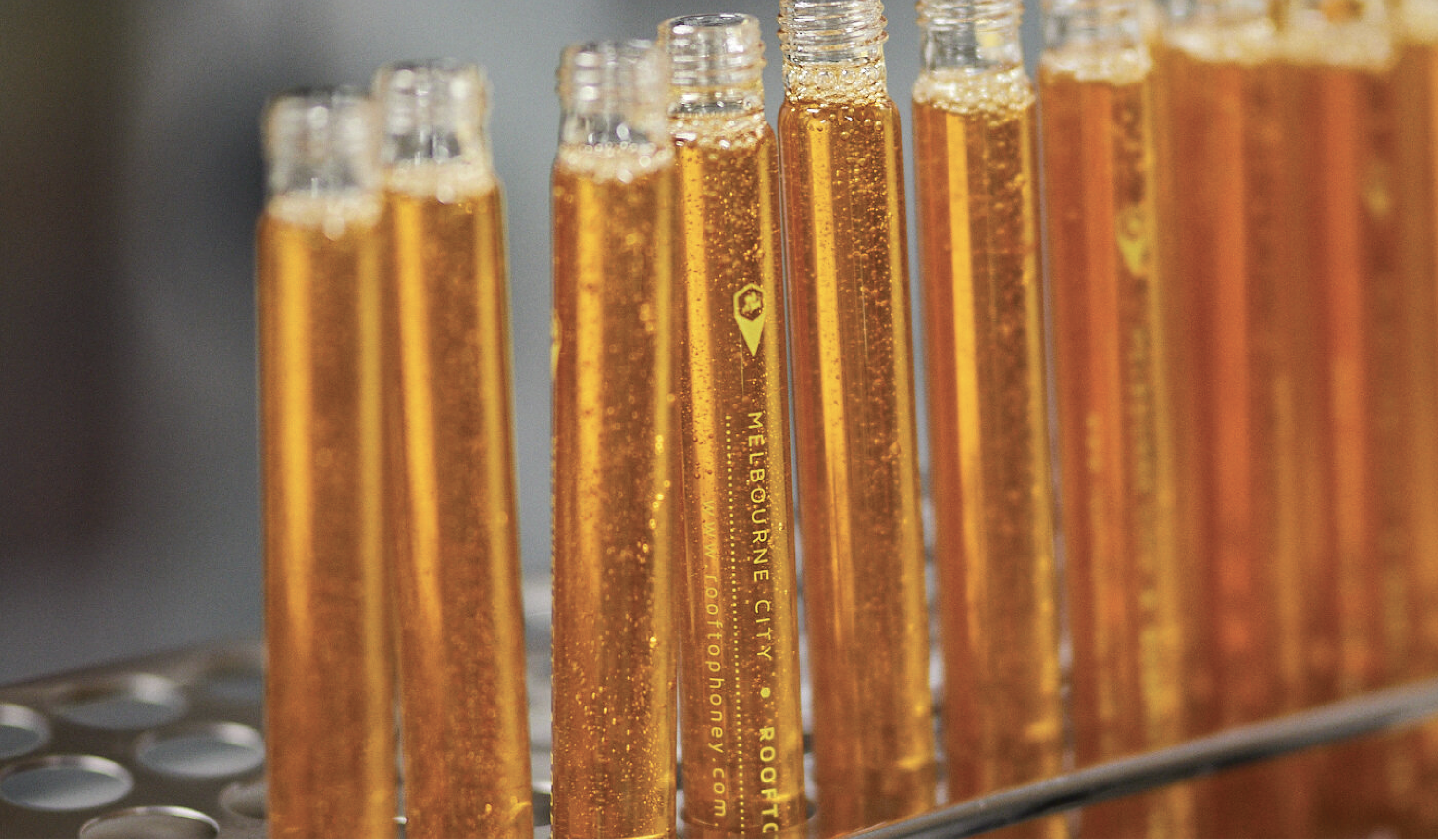
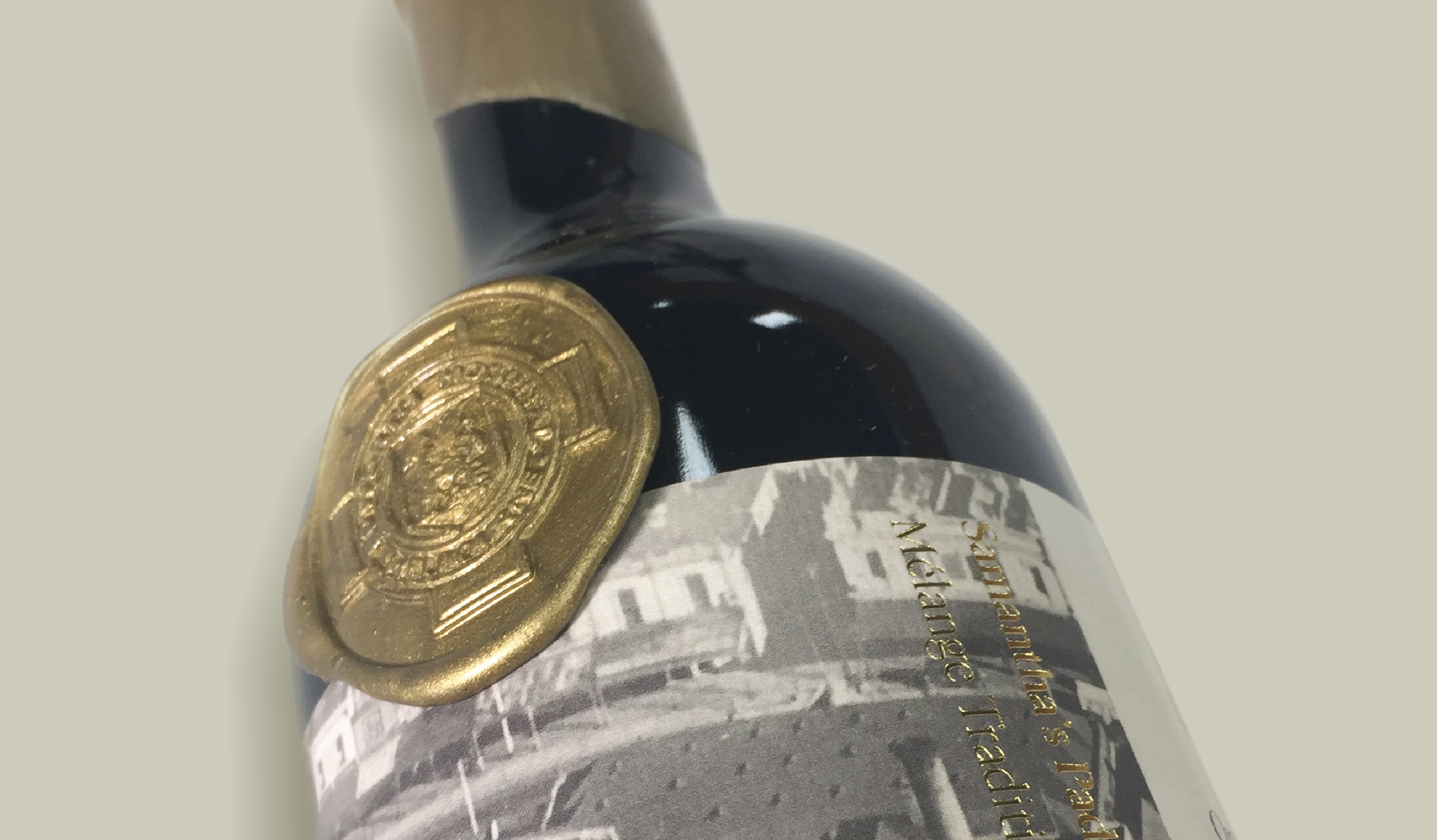
The packaging designed for Melbourne City Rooftop Honey products embodies their dedication to sustainability, using recycled materials and minimalist techniques that beautifully showcase the purity of their honey.
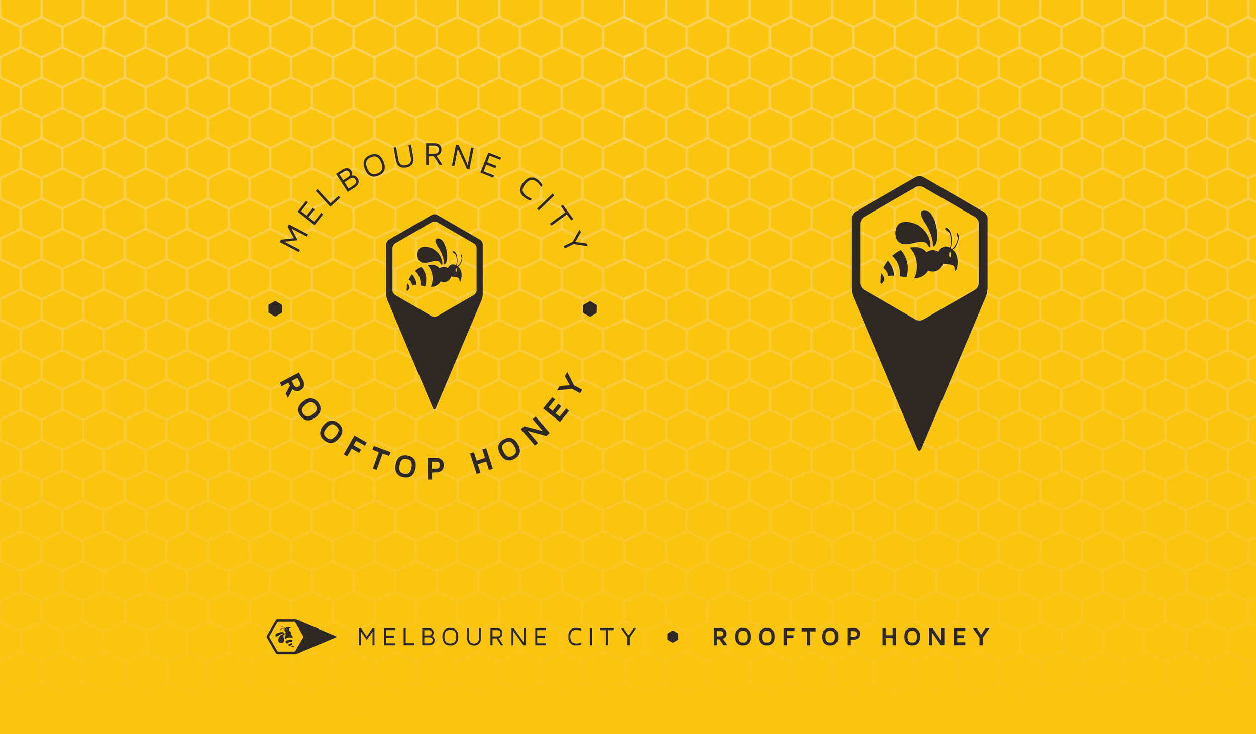
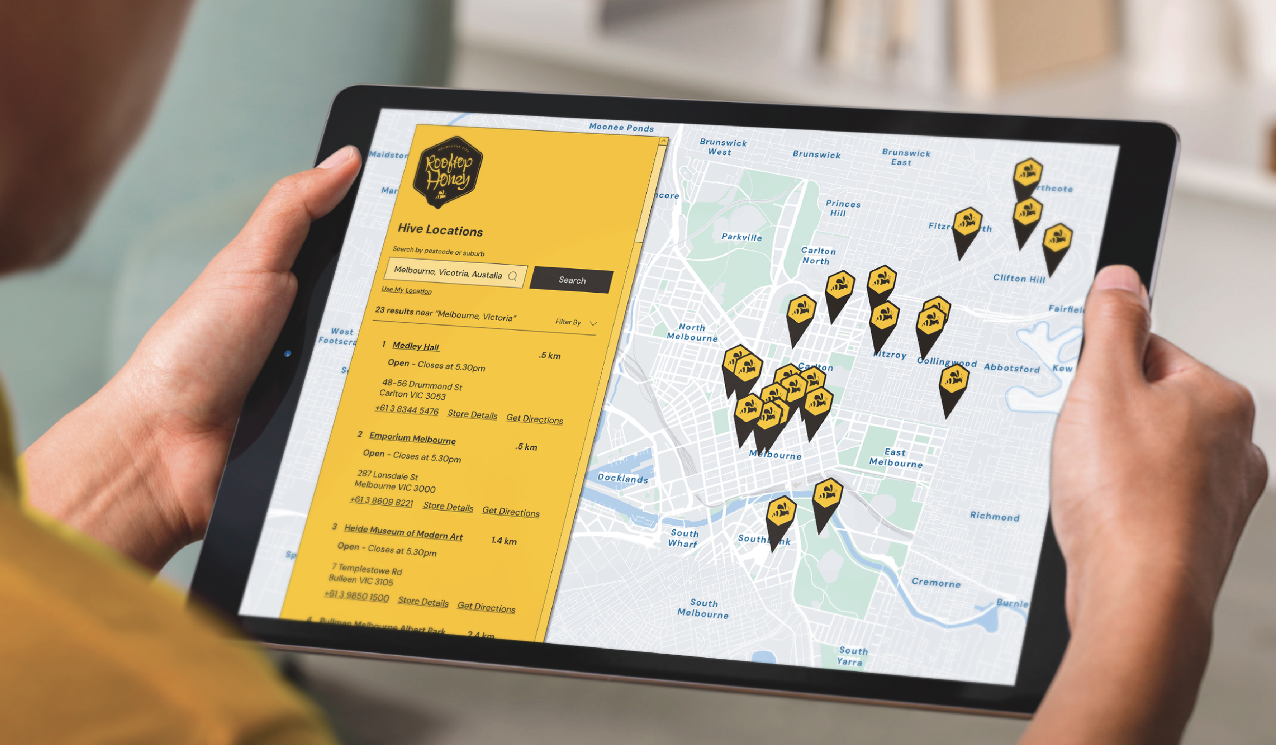
Their strong ties to the local community shine through in their partnerships with nearby businesses and beekeepers, symbolised visually by a location icon that threads through their brand—from packaging to website.
In essence, Melbourne City Rooftop Honey’s logo, packaging, and overall brand identity harmoniously embody their values of sustainability, community support, and top-notch quality. This makes them a cherished favorite among honey enthusiasts who prioritise locally sourced, ethically produced goods.
Industry: Product / Sustainability
Branding, Website Design, Graphic Design, Print, Social Media

Let’s Talk