
Vanmod
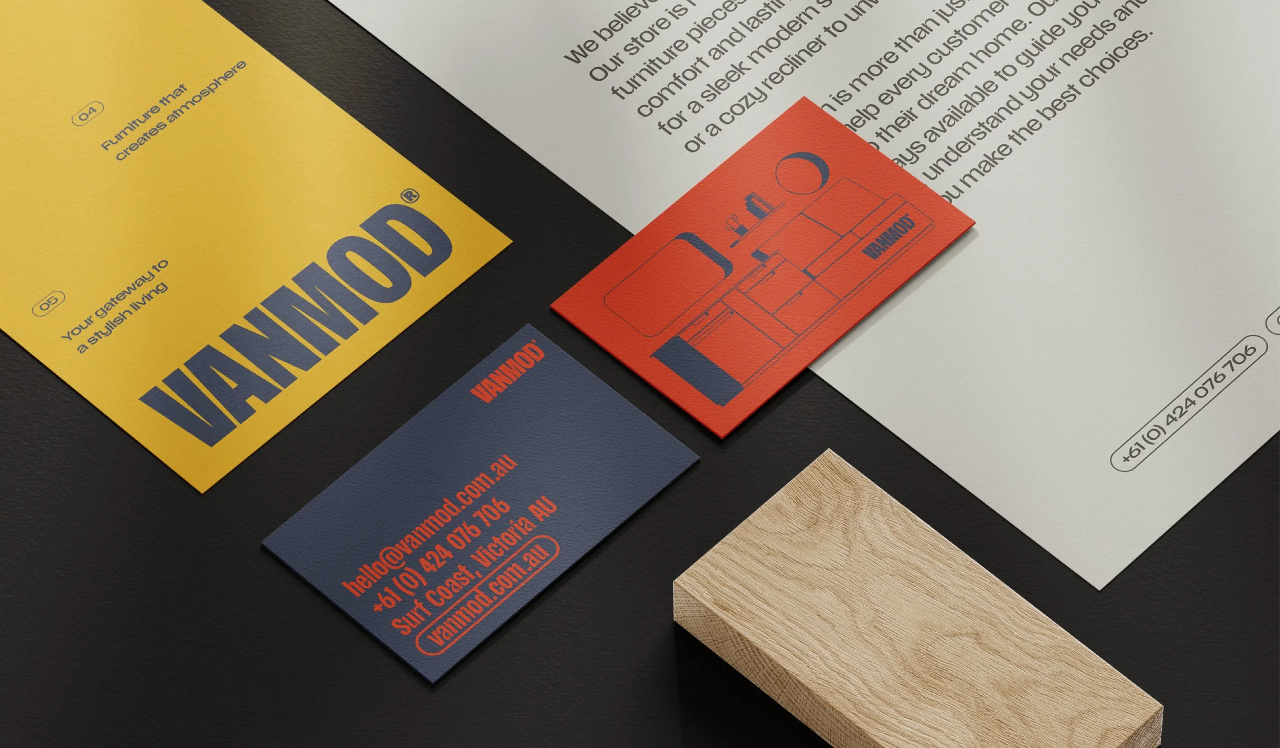
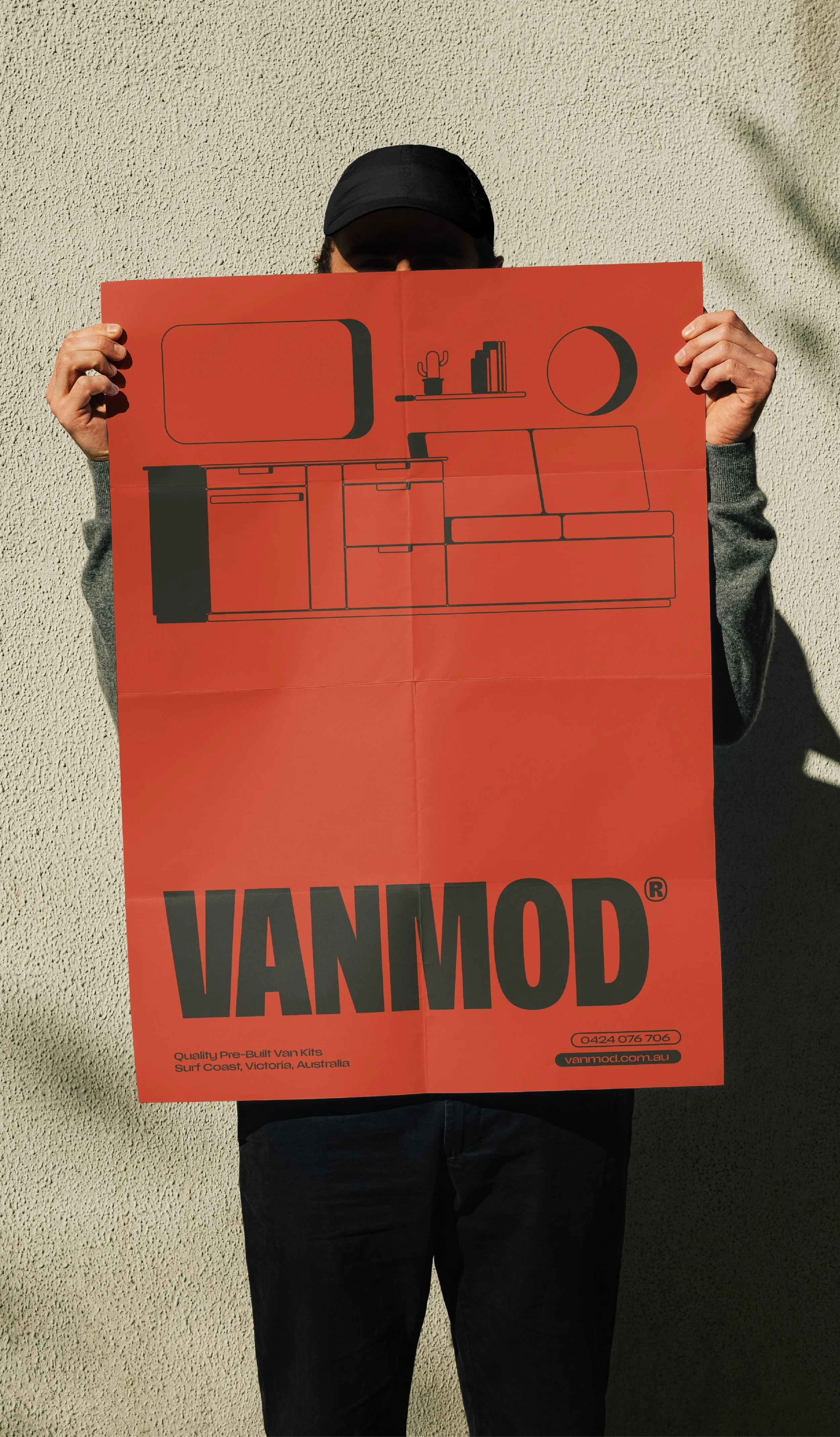
Vanmod has been designed to stand apart in a category often dominated by technical specifications and utilitarian branding. Instead, the identity positions the business as a modern, design-led manufacturer that builds premium pre-built van kits with simplicity, quality and functionality at its core.
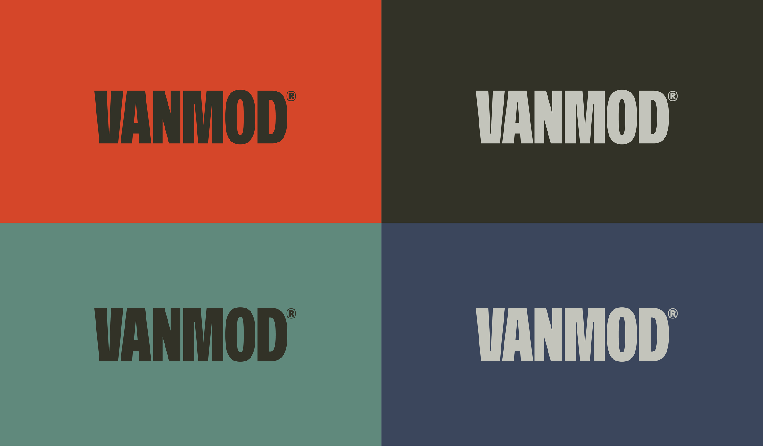
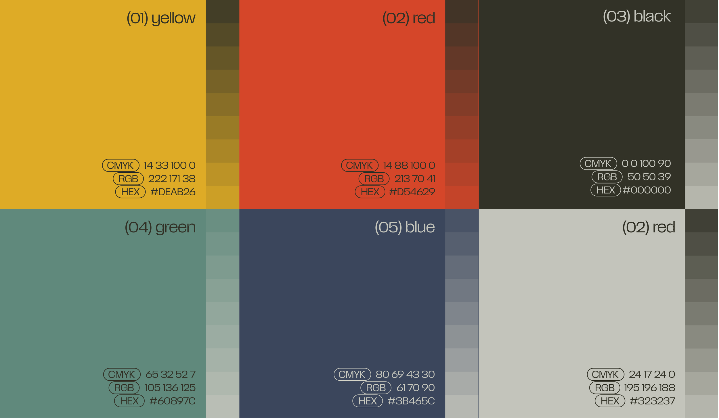
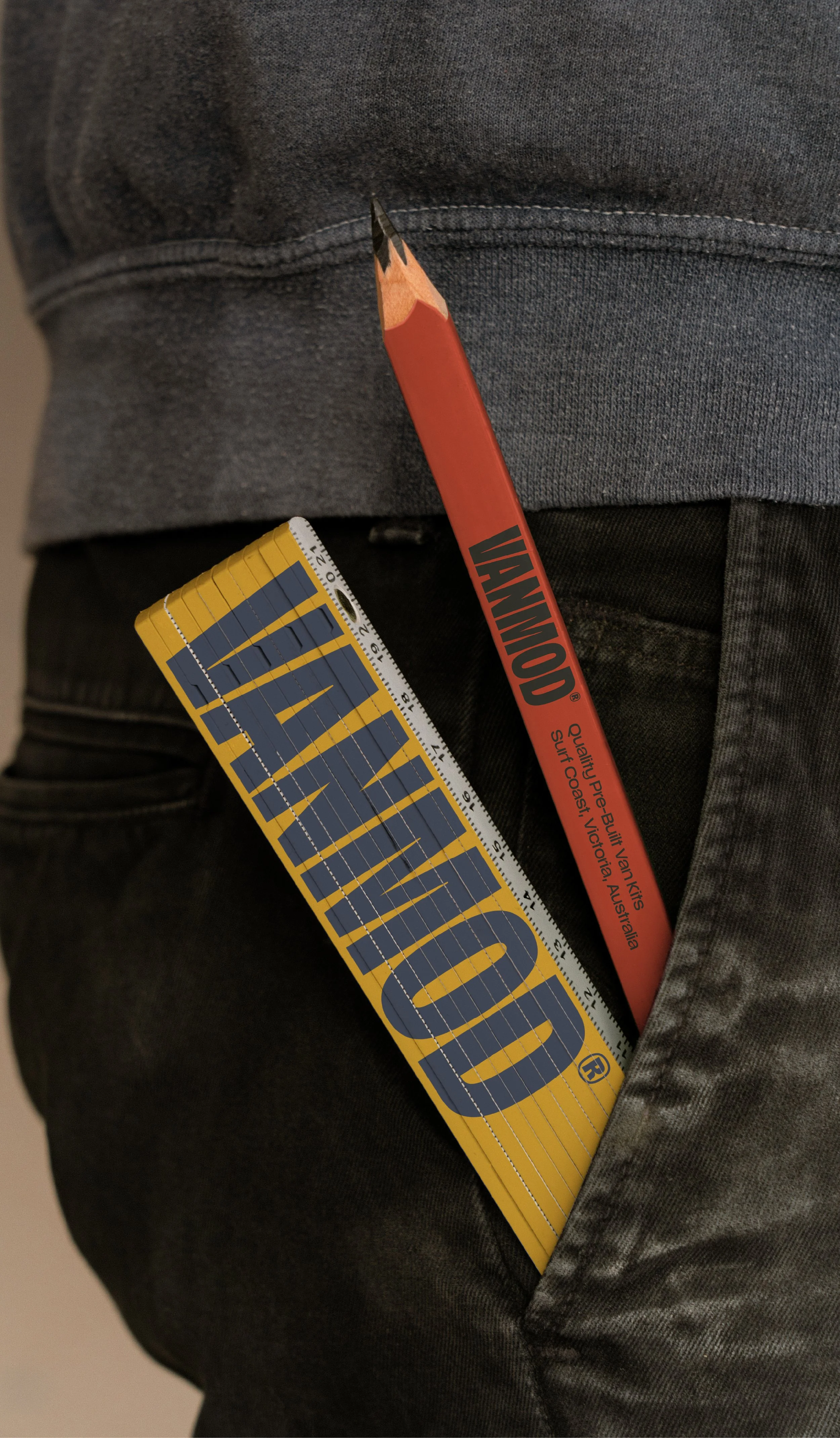
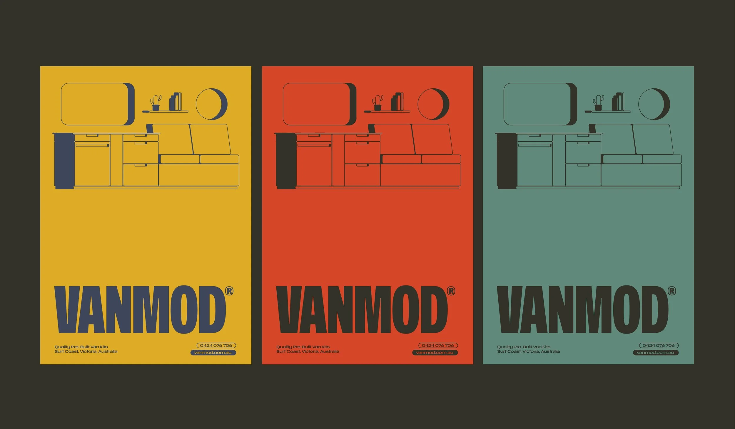
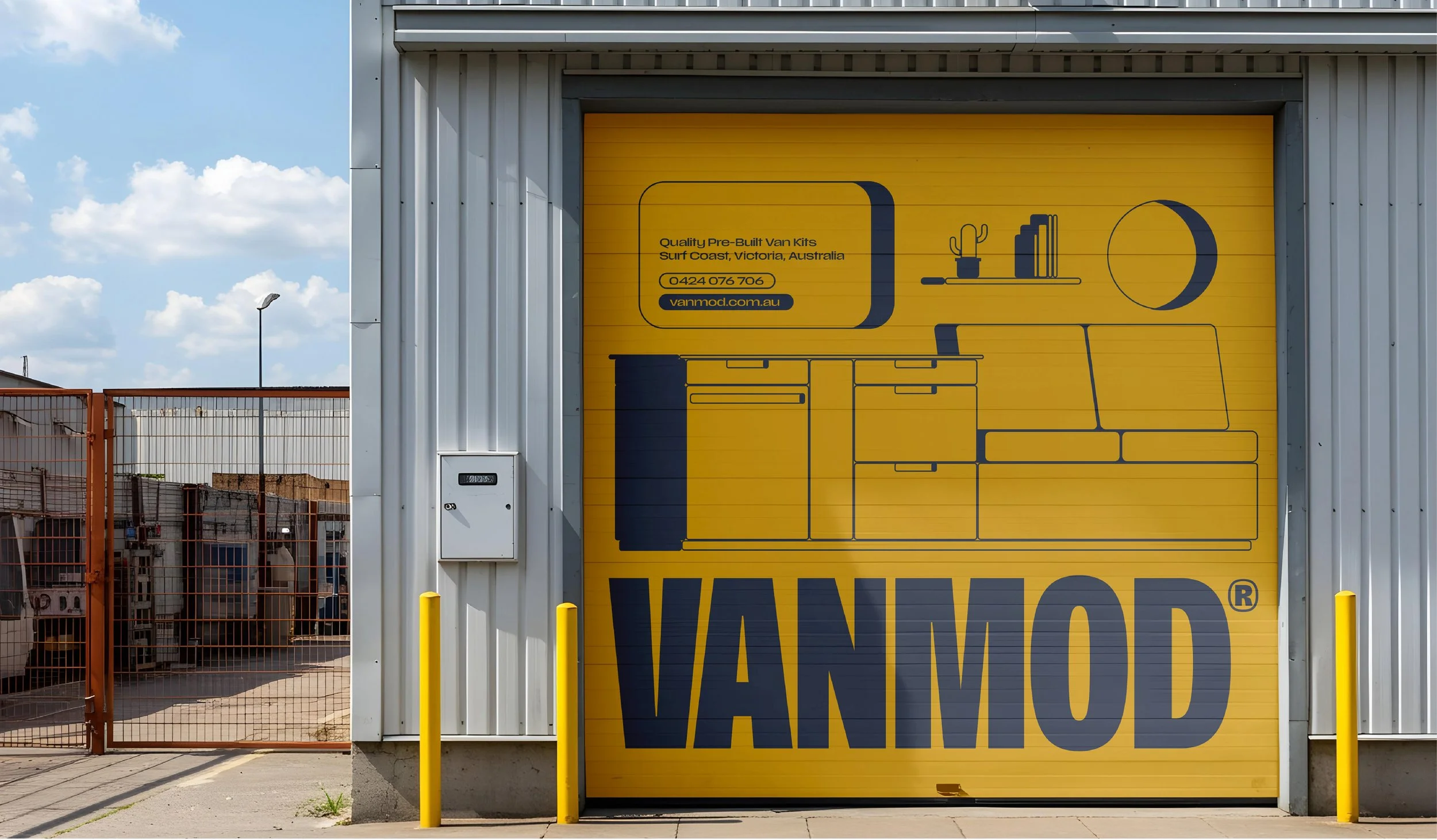
The bold condensed wordmark creates an unmistakable presence, reflecting the strength and durability of the product while remaining confident and approachable. A distinctive colour palette of yellow, red, green and blue draws inspiration from the outdoors, travel and exploration, allowing the brand to feel energetic, memorable and highly recognisable across both digital and physical environments.
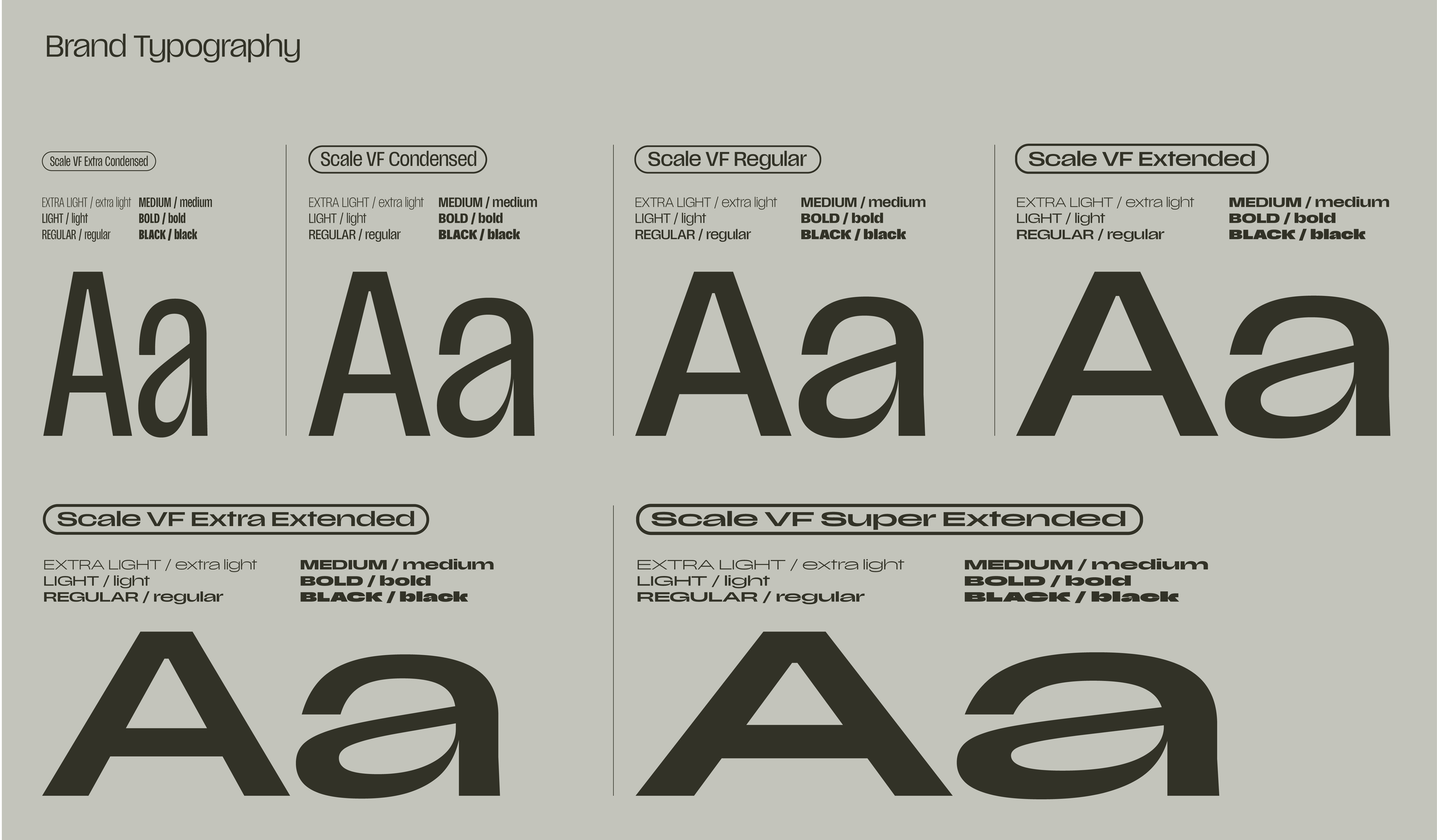
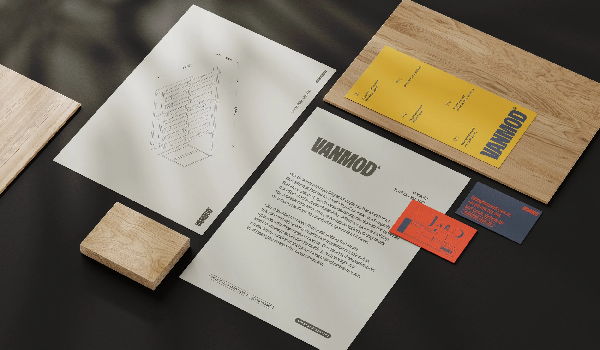
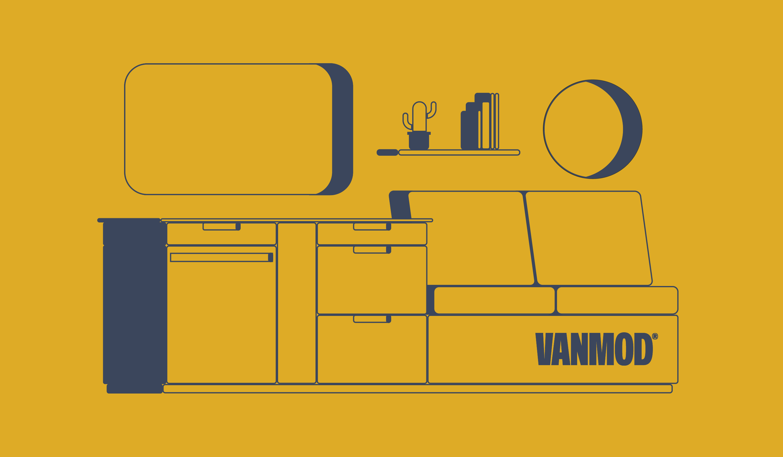
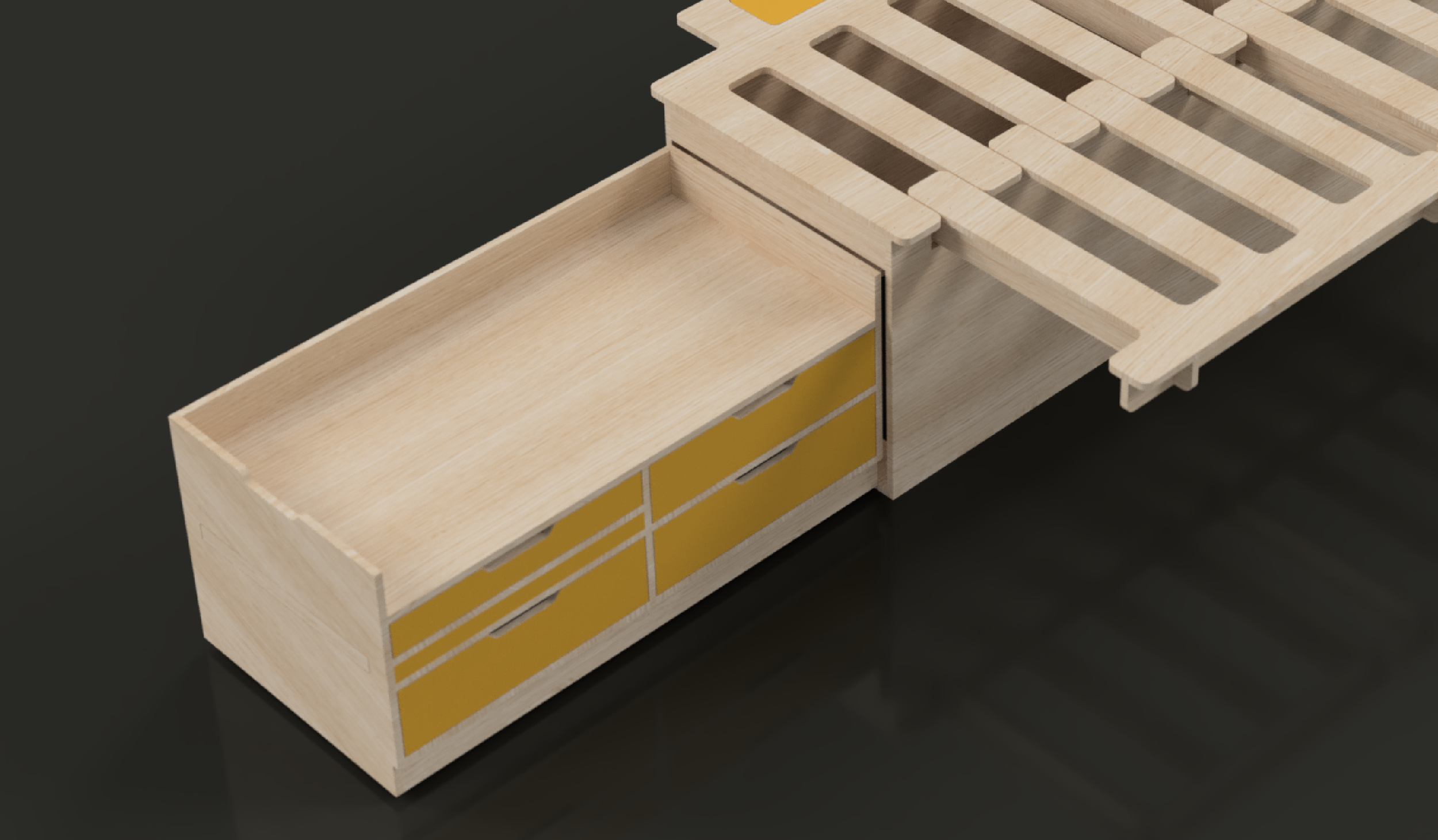
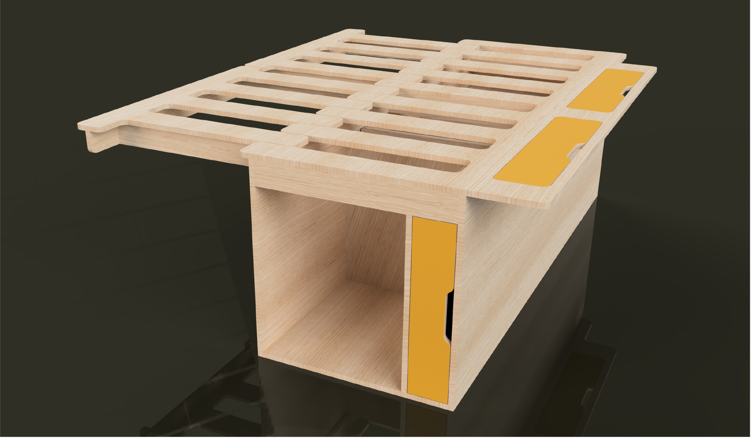
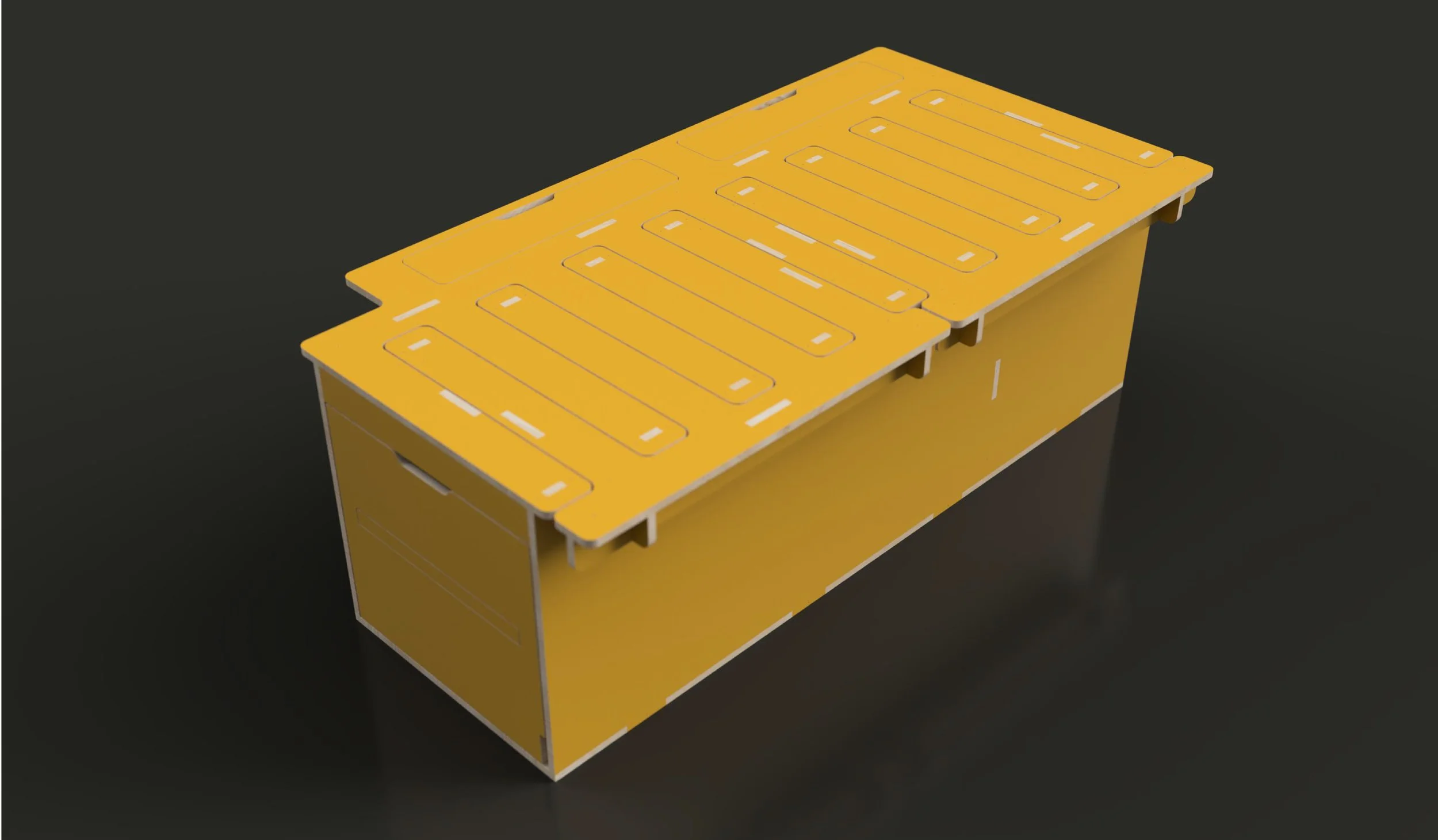
Supporting the identity is a custom illustration system that showcases the modular nature of the products through simplified line drawings. These graphics communicate functionality in an accessible way while becoming a recognisable visual asset across the brand. Paired with clean typography, generous space and minimal layouts, the identity balances technical precision with contemporary design.
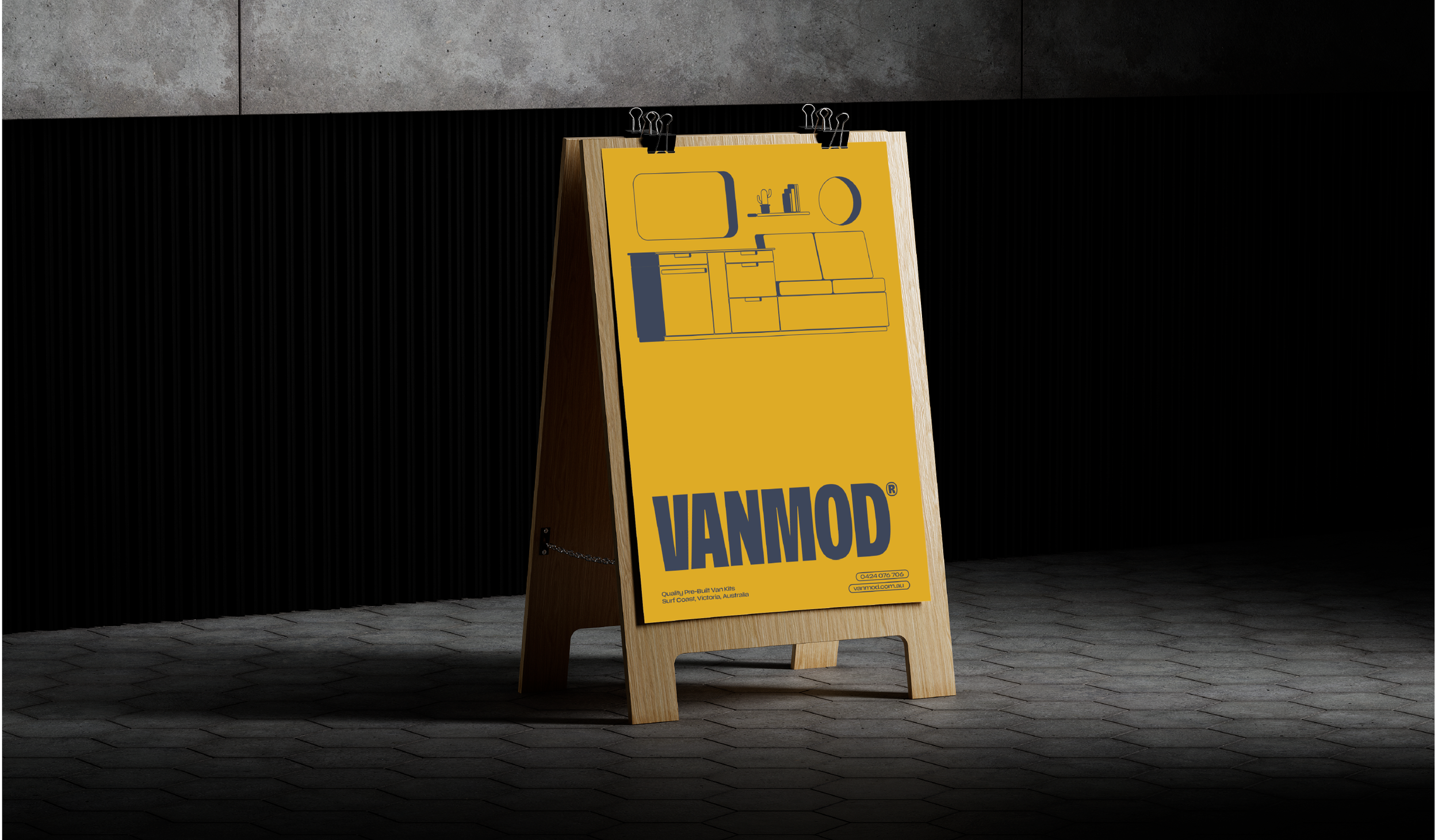
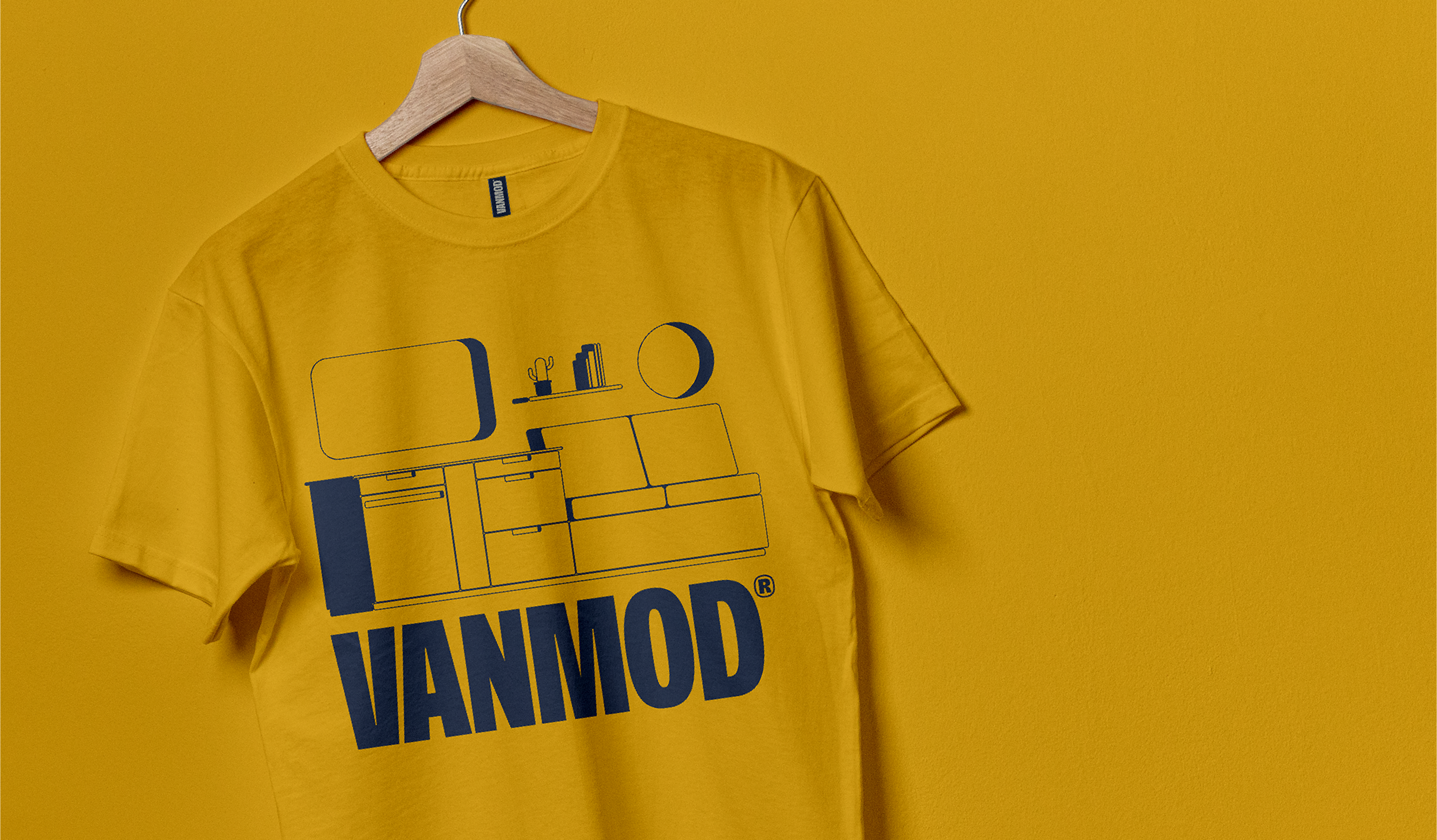
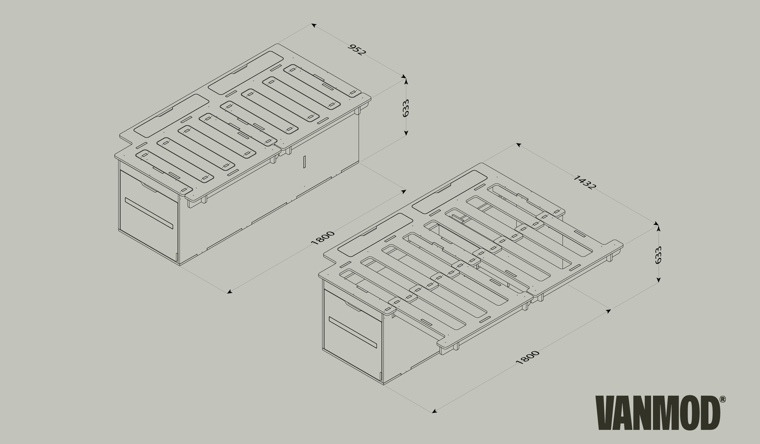
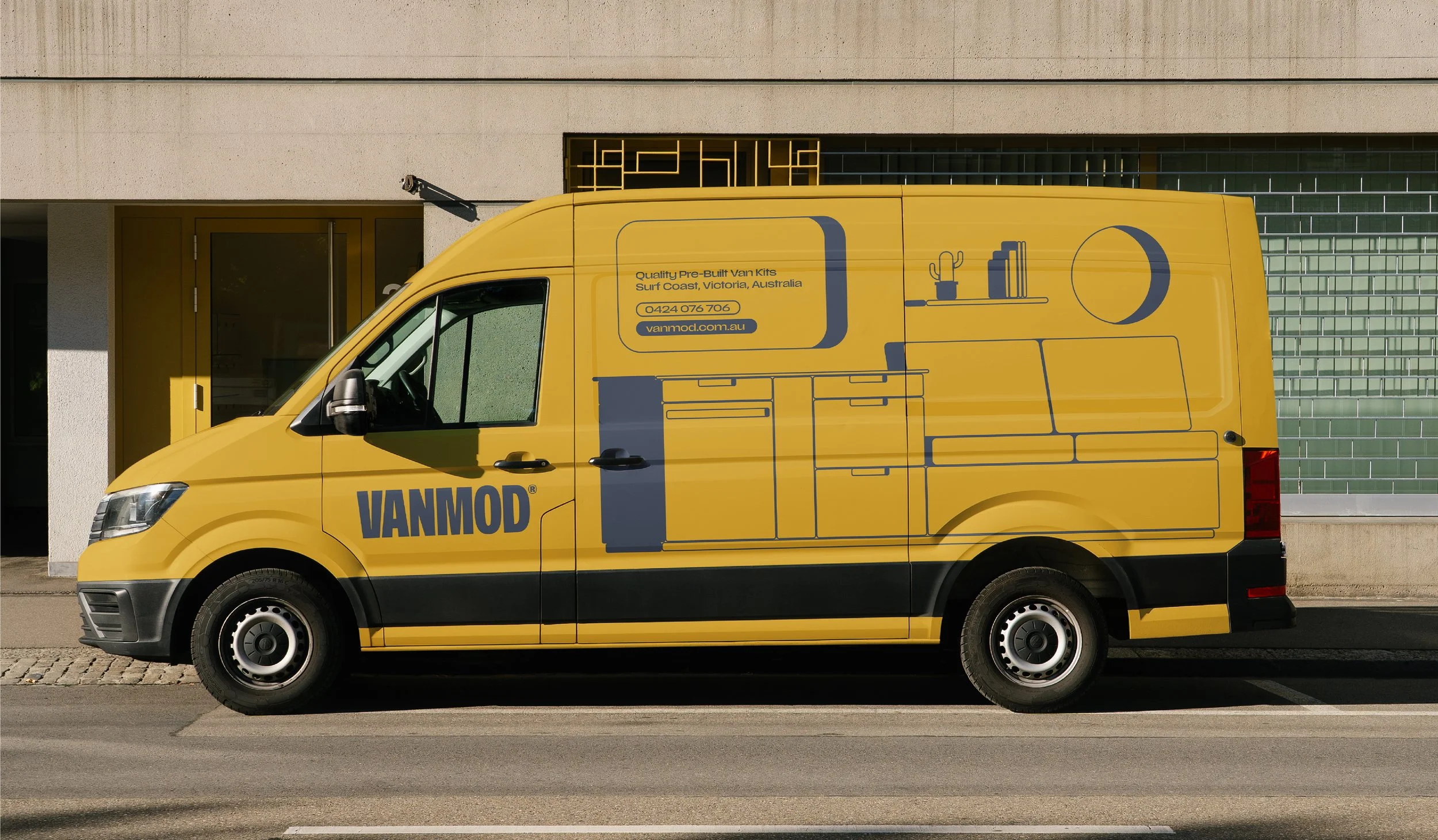
The touchpoint strategy extends this visual language across every customer interaction, from vehicle graphics, packaging and product documentation to social media, merchandise, signage and printed collateral. Every application has been designed to reinforce consistency, creating a cohesive brand experience that builds trust while positioning Vanmod as an innovative leader in modular van conversions.
Industry: Product / Automotive
Branding | Logo Design | Visual Identity | Signage | Animation


Let’s Talk